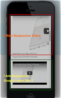
If you directly add Youtube videos to your website or blog without making them responsive, then the video might go out of the frame on smaller screens - forcing your readers to tilt their screens or they may just leave your blog or website without watching the complete video.
Here's a screenshot which shows you the difference between a non-responsive and responsive embeded Youtube video:
 |
View Live Demo Here |
So here's how you embed Youtube videos in responsive layouts
You just need to add a responsive div tag within which we will put the Youtube videos. So, rather than simply adding a code to embed Youtube videos like this:
<iframe allowfullscreen="" frameborder="0" height="315" src="https://www.youtube.com/embed/Om6tnEP6vvU" width="560"></iframe>
Use this code:
<div class="video-container">
<iframe allowfullscreen="" frameborder="0" height="315" src="https://www.youtube.com/embed/Om6tnEP6vvU" width="560"></iframe>
</div>
Observe the code highlighted in RED above. To tell your blog, what a "video-container" in the above code means, we will define it in the blog's template (this part of our CSS code will make the Youtube iframe code responsive):
Go to Blogger -> Template -> Edit HTML and search for this code:
</head>
And immediately above it, paste this piece of code:
<!-- responsove youtube videos starts-->
<style type='text/css'>
.video-container {
position:relative;
padding-bottom:56.25%;
padding-top:30px;
height:0;
overflow:hidden;
}
.video-container iframe, .video-container object, .video-container embed {
position:absolute;
top:0;
left:0;
width:100%;
height:100%;
}
</style>
<!-- responsive youtube videos stops help@ BloggerStop.Net-->
Save the template and that's it!
Now all the videos in your blog within a div class "video-container" will be flexible and in sync with the viewer's screen size.

Comments are moderated on this blog
Allowed HTML tags: <b>, <i> and <a>
Comment Like This! and Optimize your blog EmoticonEmoticon